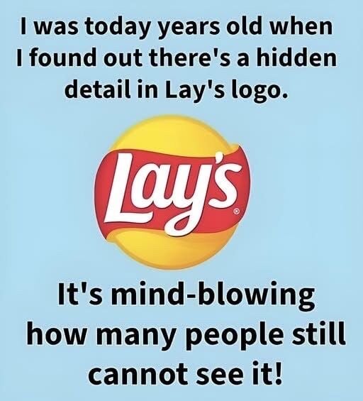
Behind that familiar yellow circle is an entire language of emotion. The sun-like shape doesn’t just hint at golden, fried potatoes; it quietly signals warmth, safety, and optimism.
The sweeping red ribbon adds movement and excitement, but its softness keeps it from feeling aggressive.
Together, they form the gentle curve of a potato chip without ever explicitly showing one, letting your brain fill in the craving on its own.
The rounded letters, the clean white type, the soft shine on the “sun” — all of it works to make Lay’s feel light, friendly, and honest, even as it sits among countless competitors.
Over decades, the logo has evolved, but never abandoned that core promise: a small, happy escape in the middle of an ordinary day.
That’s the real hidden meaning of the Lay’s logo — not just design, but an emotional shortcut straight to comfort, nostalgia, and the simple joy of opening a bag and hearing that first crisp crackle.