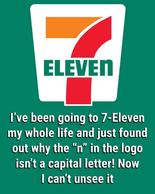
Most people speed past the 7‑Eleven sign without a second thought, but once you spot the lowercase “n,” it starts to bother you. It isn’t an error, and it isn’t a secret code.
It’s the quiet result of a single suggestion that softened the entire brand. When the company shifted from Tote’m Stores to 7‑Eleven and embraced its bold red, orange, and green logo, the word “ELEVEN” was originally written in all caps.
It looked strong—but it also felt cold and harsh.
According to the company’s own lore, the president’s wife proposed a simple fix: drop the last “N” to lowercase so the logo felt friendlier, more welcoming, less like a shout.
That tiny change stuck. Decades later, the odd little “n” still softens the heavy 7 above it, makes the word more approachable, and gives the logo a subtle quirk people remember. A single letter, barely noticed, quietly turned a store sign into an icon.